Google has rolled out a new design for its social networking service, Google+. The new design is cleaner and easier to navigate. The new Google+ design looks great and could even make it less intimidating for new users. So, if you have been off Google+ for awhile, this is a great time to dive back in.

1. Click access to important sections
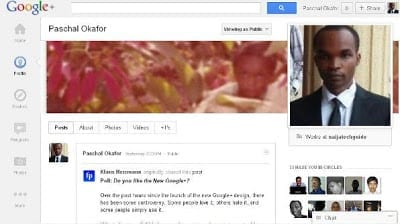
The new Google+ design has a navigation ribbon on the left side with buttons to your Google+ Home, Profile, Explore, Hangouts, Photos, etc. The navigation ribbon floats so that they are always visible no matter how much you scroll down the page. This makes navigating different sections of Google+ easy and fast.
Five buttons are visible with 3 other buttons dropped in the More button. Except for the Home button, the position of all the other buttons can be moved to suite your preferences. Google+ now has a dedicated hangout page that makes it a lot easy to start and manage your Hangouts as well join or view other Hangouts taking place.
2. A Refined and Cleaner Profile
The new Google+ profile is a lot cleaner. Google has also moved things around a bit. The profile photo is larger and has been moved to the right. Viewers of your Google+ profile can now easily see important information about you that you allow them to see like where you work, the school you studied, where you live, etc. This information appears below your Google+ profile picture.
People you have on your Circle have been moved from the left to the right. Google has also added a cover photo option to the scrapbook photos so that you can add a cover photo on your Google+ profile just like on Facebook Timeline.
3. 170 million Google+ users
Google+ user base grew to 170 million up from 90 million in January. Although users spend less time on Google+ compared to Facebook, this new design may lead to more engagement. I suspect users may now spend more time on Hangouts. Google also said this redesign is just the beginning, users should expect more in coming months.
What do you think about the latest Google+ design? Share your thoughts with me as a comment.
More Google Related Articles
- Google Play added to Google Nav bar
- Google Play Store replaces Android Market
- Google Trader Mobile
- Google+ has over 90 million users
- Google Mobile Advertising
- Google Music Service
- Google Chromebooks Overview
- Google Offers Overview
- Google Wallet Overview
- Google ebooks: access your books from the cloud
- Tips on using Google Baraza
- Understanding Google Baraza
- Google map maker for Nigeria


