It’s rightfully said that a picture is worth a thousand words. Well, we all know that human brain remembers a picture way more than the texts. That’s why the use of pictures has seen a sheer hike in today’s world.
Various websites are also making huge use of images to increase value and engagement. Leading names in the web design industry like Intlum are not only making good use of images but they are also mixing the images with texts to make a better impact on the users’ mind. What are those texts called? Typography!
Typography is not about picking up any random font, choosing the font size, and including it to your graphics. Typography is the companion for your graphics.
It is an integral part of your graphic designing and the art and technique to the type arrangement. This is one of the untold and ignored skills that can make you unique and different from the rest of the designers in the field.
What is Typography?
Before jumping to the art and technique of typography, let’s have a quick understanding of what typography really is. Typography can be called a visual representation of texts. The texts can be represented in three forms – visually, audibly, and digitally. The visual presentation is our today’s topic: Typography.
Typography is way more than designing the letters and characters. The whole matter of typography revolves around the choice of point size, line length and spacing. So, you have to be careful while crafting the typography.
Importance of Typography:
Loads of web development companies are considering typography as one of the serious aspects of web design. Typography can be found almost everywhere you look around.
Whether it is your coffee cup, clothes, smartphone, billboard or anything else, you will certainly find various types of typographies which can blow your mind and please your eyes.
The message conveyed depends on the choice of colors, fonts, gaps, letter, and character arrangements. Even if you consider this as a small aspect, these delicate aspects will play a big role together when it comes to the impact on your audience.
You might have noticed that Facebook authority introduced a new font back in 2016 called Geneva while the social networking giant used to make use of the Helvetica font before. Geneva was a little lighter version of the Helvetica font. Though it is a small update but easily noticeable.
Rules of Typography:
You must be wondering how a choice of typography can come under rules but there are certain rules in typographies which have to be followed in order to cultivate the best result.
The choice of the typeface has to maintain the layout, color theme, grid, and design theme.
Following are some of the most significant rules of Typography practiced by the professional web design companies. You need to consider them as well in order to generate a desired result.
Choosing the Right Font:
A little amount of time spent on the internet would make you aware of a range of ready to use fonts which you can avail for free or by paying a little amount.
But the plethora of options does not indicate hours of research and development for finding the font that matches your imagination.
You can (and should) start painting with the limited palette if you can’t find the exact one. Basically, if you spend too much time in finding the font, then other important work would be undone and incomplete. Ubiquitously tried and tested fonts like Helvetica can (almost) never go wrong with any project.
The professionally crafted fonts come with a great range of customization which includes customizing weight and style to form a complete family. Moreover, they also provide support for multi-language, type-setting, etc.
Size:
One thing that needs to be taken into consideration prior to any other thing is that each of the typefaces are not created equally.
Some of them are thin and narrow whereas others are fat and wide. The different kinds of typefaces will, quite naturally, acquire different volume of space on the web page.
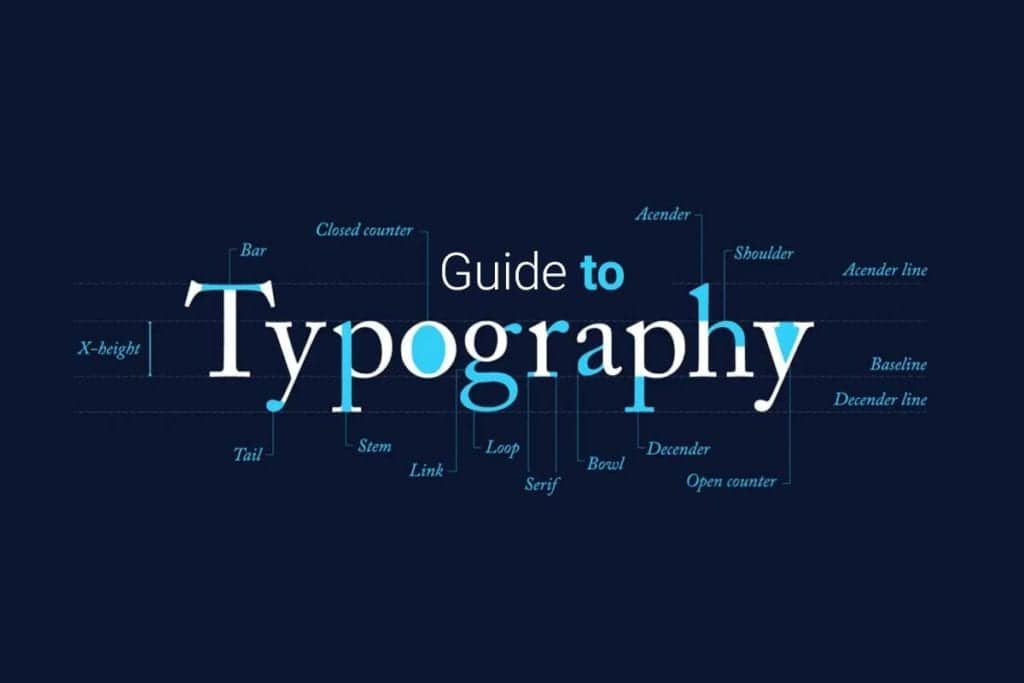
In typography, the height of the characters is called X Height. Thus, always try to make use of those typefaces which share similar X Height when you pair different typefaces together.
On the flipside, the width of the letters is called Set Width which defines how much space the letter will acquire and how they will buffer with one another. Check our other blog layerpoint.
In order to measure the type, point system has been a great help which was invented and being used since the 18th Century. Each of the points is measured as 1/72 inch.
12 points can produce a pica which is a unit to measure the column width. You can also measure the sizes in millimeters, inches, and pixels. However, the whole matter will be subject to the requirement of the project.
Leading:
The vertical space plays a big role in creating a distinction between the lines when typography is concerned. The reason why it’s labeled as leading is because of the usage of slips of lead between the lines of type back in the time of metal typesetting.
The rule to get a readable body text is to use a leading value higher than the font size. You can use a leading value higher in 1.25 to 1.5 times.
Conclusion:
Typography plays a pivotal role in today’s website designing and development. Any web design company will certainly be careful while creating the typography.
Since the tremendous competition of today’s world demands every little inch of your website to be furnished and crafted well, typography can never be ignored.
While making use of typography, you should never neglect the aspect as it may become the reason for users to choose your service over others.
So, make sure, you are making a smart use of typography in order to grab the users who are coming to your site in a bulk amount but not getting satisfied because of the design. And the quality of the design may depend on the quality of the typography used on the site.


